Choosing interior paint colors is about more than style or trends. The colors you surround yourself with every day can influence mood, energy levels, and even how comfortable you feel.
This is where interior paint color psychology comes into play. If you’ve ever walked into a room and instantly felt calm, energized, or cozy, the color palette likely played a big role.
Understanding how different colors affect the atmosphere of a room can help homeowners make smarter decisions when choosing paint colors for home interiors. The right color can brighten a dim space, create a relaxing atmosphere, or provide a sense of warmth that makes guests want to stay awhile.
Below, we’ll walk through how color psychology works and how to apply it when choosing interior paint colors for your home. And if you already know you'd like a fresh look but need help narrowing down your options, our interior
painting service page is a good place to start.
Why Interior Paint Color Psychology Matters
Color psychology refers to the way different hues influence human emotions and behavior. Designers and painters use this concept regularly when planning interiors.
When you understand how room colors affect mood, you can make better decisions about the atmosphere you want each room to create.
For example, some colors help promote relaxation and sleep, while others encourage conversation and energy. Certain shades can even make a space feel larger or brighter.
The goal is not just to find good paint colors for your home, but to choose colors that support how you want each space to feel and function.
Warm Paint Colors: Energy, Comfort, and Conversation
Cool Paint Colors: Calm, Focus, and Relaxation
Neutral Paint Colors: Timeless, Flexible, and Easy to Coordinate
Moody Interior Paint Colors: Creating Depth and Character
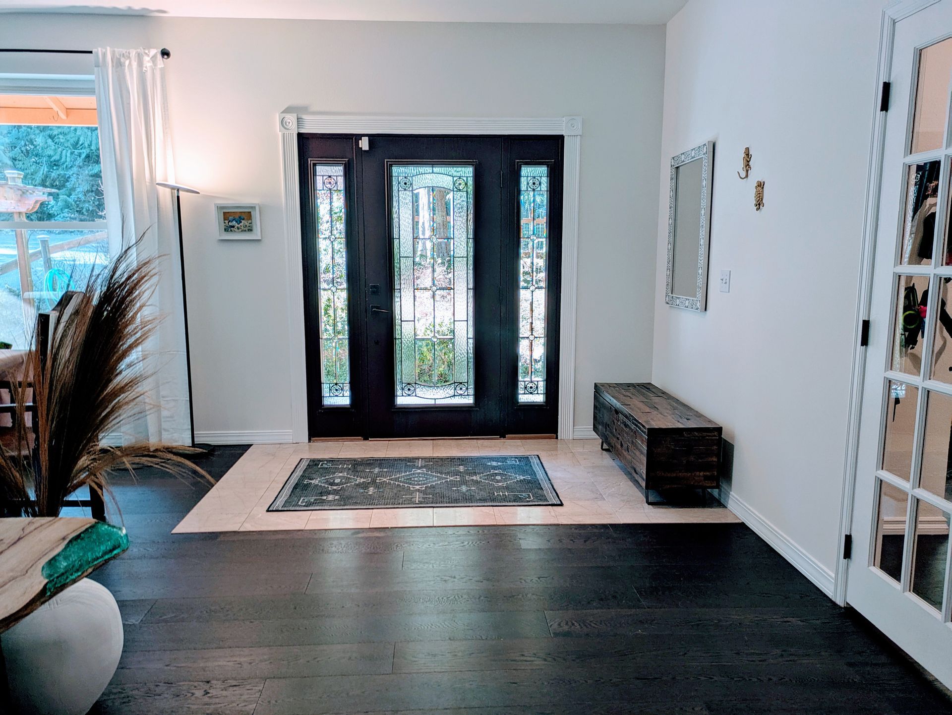
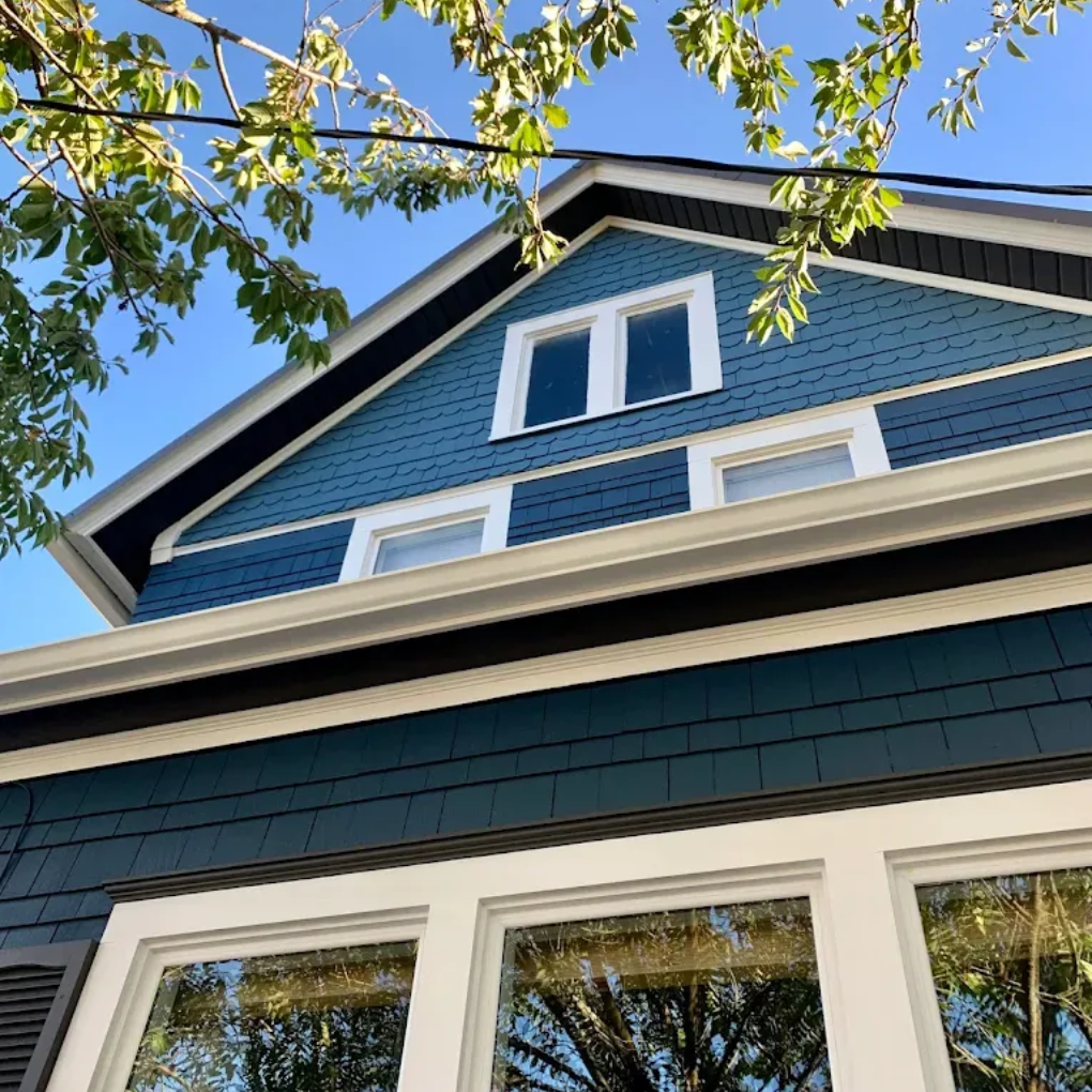
While light neutrals remain popular, those feeling a bit bolder can also experiment with moody interior paint colors to add depth, contrast, and personality to their homes. These deeper shades bring visual weight to a room and can make a space feel more grounded and intentional rather than bright and minimal.
Some of the best dark interior paint colors include rich tones like navy blue, charcoal gray, forest green, deep teal, and muted burgundy. These colors are often used to create contrast against lighter trim, ceilings, or natural wood features.
Bedrooms are one place where darker colors can work particularly well. Many homeowners choose dark paint colors for bedrooms because deeper tones reduce visual brightness and create a calmer environment compared to very light walls. Shades like navy, deep green, and charcoal gray can make a bedroom feel comfortable and restful without relying on stark whites or overly bright colors.
Instead of painting every wall in a dark shade, moody colors are often used in more focused ways:
- Accent wall paint colors in bedrooms or living rooms
- Dark paint behind built-in shelving or bookcases
- Statement walls in dining rooms
- Bold home office colors that help create contrast and improve focus
Using darker tones strategically allows homeowners to introduce depth without overwhelming the space.
Although darker paint colors can sometimes make a room feel smaller if used poorly, they can also create a sense of depth when balanced correctly. Darker colors naturally recede visually, meaning the wall can appear farther away rather than closer. Pairing these tones with white trim, lighter ceilings, or natural wood finishes helps maintain contrast so the space still feels open and comfortable.
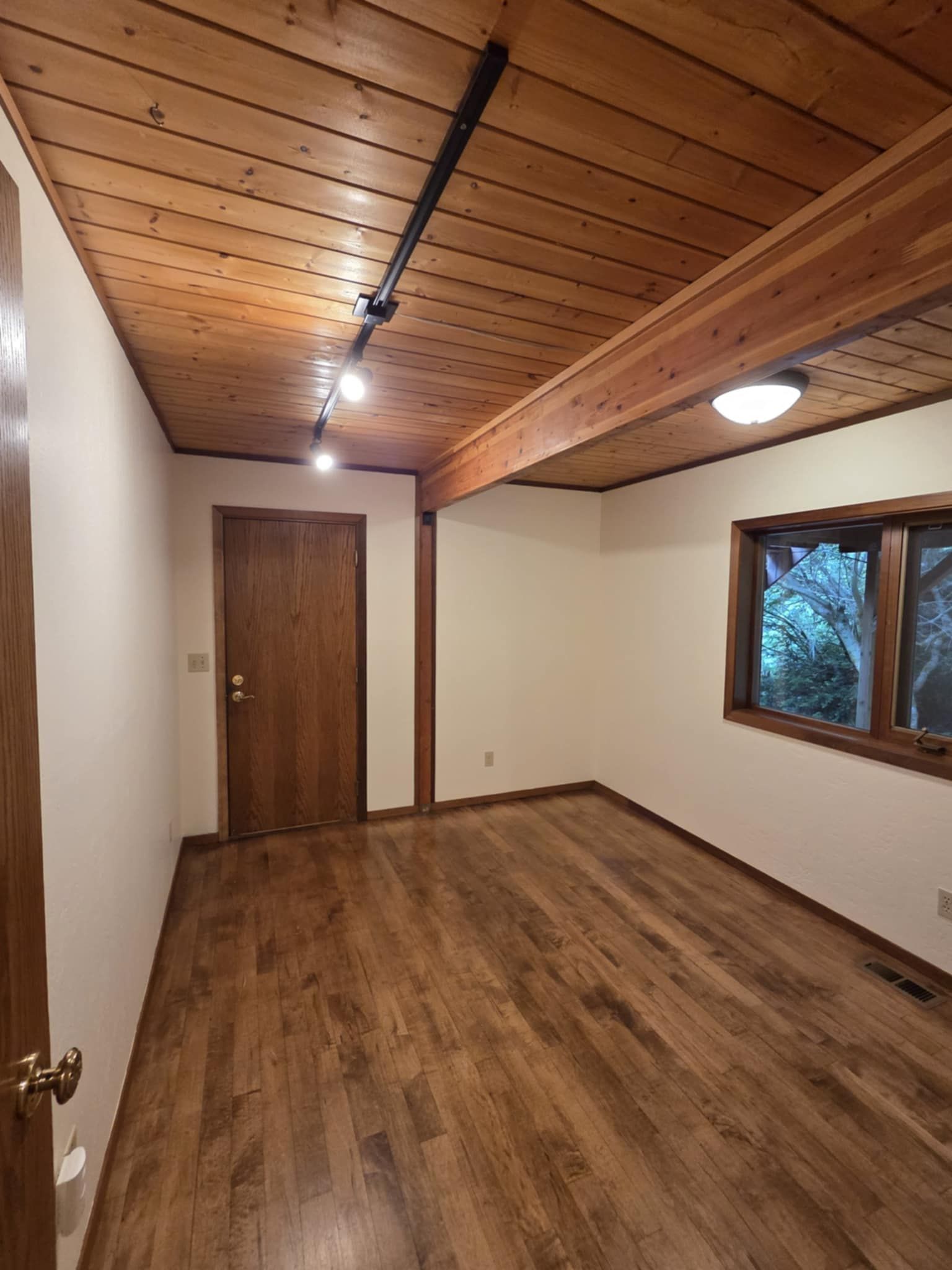
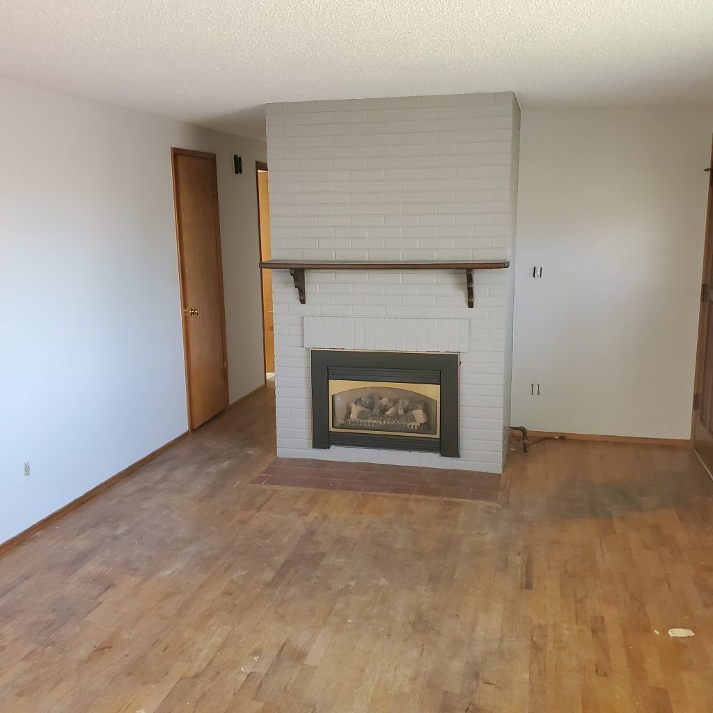
Moody colors also tend to work well in homes with natural materials like hardwood floors, exposed beams, or stone fireplaces. In regions where natural greenery and softer daylight are common, deeper tones often complement those surroundings and create a warm, layered look rather than feeling too dark.
When used thoughtfully, moody interior paint colors can transform an ordinary room into a space that feels rich, relaxed, and full of character.
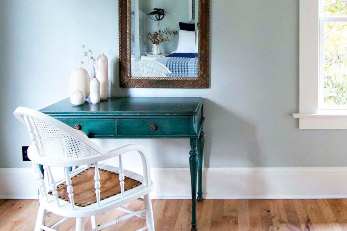
Accent Wall Colors: A Simple Way to Add Personality
Accent walls remain one of the easiest ways for homeowners to experiment with color without repainting an entire room. Instead of covering every wall, a single wall is painted in a deeper or contrasting shade to create visual interest and draw attention to a specific area of the room.
Many of the best accent wall colors tend to be shades that add noticeable contrast without overpowering the room. Homeowners often gravitate toward colors like smoky blue, olive green, soft black, clay-inspired rust tones, or even muted plum for a little extra depth and personality. These kinds of colors work well because they create definition and visual interest without overwhelming the space.
Accent walls are most effective when they highlight a natural focal point in the room. In bedrooms, this is often the wall behind the bed. In living rooms, it may be the wall behind a fireplace, built-in shelving, or a television. Dining rooms and home offices are also common places to use accent wall paint colors because they can add personality while still keeping the overall room balanced.
Lighting and room layout also play an important role. In many Pacific Northwest homes, natural light can vary significantly depending on tree cover, window placement, and the time of year. Darker accent wall colors can actually help anchor a room visually, especially when the surrounding walls are lighter. When balanced with white trim, natural wood tones, or lighter ceilings, the contrast often makes the space feel more intentional rather than darker.
Accent walls are also a practical way to explore interior paint color psychology. If you’re curious about deeper colors but unsure about painting an entire room, a single accent wall lets you test how that color affects the mood of the space. Many homeowners find that this approach gives them the character of darker colors while keeping the room bright and comfortable overall.
When done thoughtfully, accent walls can turn an otherwise simple room into a space that feels layered, modern, and uniquely personal.
Choosing Paint Colors for Bedrooms
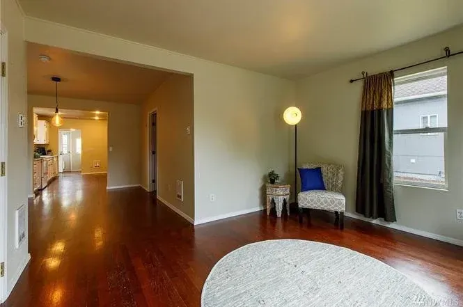
Paint Colors for Living Rooms and Gathering Spaces
While bedrooms often benefit from softer, calming tones, living rooms and gathering spaces tend to work best with colors that feel warm, welcoming, and slightly more vibrant. These are the rooms where people relax together, entertain guests, and spend time during the day, so the color palette often leans toward shades that feel comfortable and inviting rather than overly subdued.
Many of our customers want paint colors for living rooms that create a balanced atmosphere—warm enough to feel welcoming but neutral enough to work with a variety of furniture, lighting, and décor.
Some popular paint colors for living rooms include:
- Warm beige or greige tones
- Soft olive or sage greens
- Muted terracotta or clay-inspired hues
- Dusty blues or blue-gray shades
- Warm neutral colors with subtle undertones
These shades work well because they add character without overwhelming the space. Slightly richer colors can also help anchor larger rooms, preventing the walls from feeling flat or washed out in bright daylight.
Living rooms are also a place where homeowners sometimes experiment with warmer or more saturated tones than they might use in bedrooms. Colors that have a bit more warmth or depth can encourage conversation and make the room feel more welcoming when friends and family gather.
Flooring should also play a role in the color decision. For example, when selecting living room wall paint colors for dark wood floors, slightly lighter wall colors often provide better contrast and prevent the room from feeling heavy. Warm neutrals, soft greens, or muted blues can help balance the darker flooring while still keeping the space cohesive.
Because living rooms often connect to hallways, kitchens, or entry areas, they frequently serve as the visual bridge between multiple spaces in the home. Choosing a color that complements nearby rooms can help the entire house feel more cohesive and thoughtfully designed.
When the palette is chosen carefully, living room paint colors can set the tone for the rest of the home while still creating a space that feels relaxed, welcoming, and easy to spend time in.
How to Choose Interior Paint Colors for Your Home
People often ask how to pick paint colors that feel cohesive across the entire house rather than choosing each room in isolation. The goal is usually to create a palette that flows naturally from space to space while still giving each room its own character.
A few practical tips when choosing interior paint colors for your home include:
Start with fixed elements.
Flooring, countertops, cabinetry, and large furniture pieces should guide your color choices. These elements are usually the most expensive or difficult to change, so selecting wall colors that complement them helps everything feel intentional and balanced.
Choose a consistent undertone.
Paint colors may look similar at first glance, but their undertones can vary widely. Warm undertones (yellow, red, beige) and cool undertones (blue, gray, green) behave very differently when placed next to each other. Keeping undertones consistent from room to room helps the home feel cohesive rather than mismatched.
Limit your main palette.
Most homes look best when built around three to five core colors that repeat throughout the house. This doesn’t mean every room has to match, but repeating certain tones helps create visual continuity as you move through the home.
Use accent colors for variety.
Accent walls, décor, and furniture are great ways to introduce contrast without overwhelming a room. This approach allows homeowners to experiment with bolder shades while maintaining a balanced overall palette.
Test colors in your actual lighting.
Paint colors often look very different once they are on the wall. Natural light, artificial lighting, and even nearby trees or landscaping can change how a color appears throughout the day. Testing a few sample swatches before committing to a full room can prevent surprises later.
When Professional Painters Can Help
Choosing the right paint color is only part of the process. Surface preparation, application technique, and even the paint finish you choose all play a major role in how the final result looks and how well it holds up over time.
For example, a color that looks beautiful in a matte finish may behave very differently in satin or eggshell. Sheen affects how much light reflects off the wall, how visible surface imperfections become, and how easy the finish is to clean. That means the “right” choice is not just about color, but also about where the paint is being used and how the room functions day to day.
Professional painters help bring all of those details together. In addition to handling prep work and application, they can help ensure:
- Even, consistent color coverage
- Smooth finishes with minimal lap marks or roller texture
- Proper prep work so paint adheres well and lasts longer
- The right finish for the room’s lighting, use, and wear
- Clean lines around trim, ceilings, and architectural details
This is often where professional painting makes the biggest difference. Once you’ve invested the time and thought into choosing colors that fit your home and your lifestyle, having them applied well helps protect that investment.
If you’re planning an interior repaint and want help turning your ideas into a polished finished space, you can learn more about our
interior painting services here.
You can also browse your
recent painting projects to see how different colors and finishes look in real homes.
Final Thoughts: Choosing Colors That Feel Right for Your Home
The psychology of paint colors reminds us that interior design is about more than appearance. The colors you choose influence how your home supports your everyday life, from how calm a bedroom feels as you get ready for bed, to how welcoming a living room is when friends and family gather.
From soothing, muted shades to warm color palettes with vibrant accent walls, thoughtful color choices can transform ordinary rooms into spaces that support comfort, creativity, and connection.
If you’re considering repainting one or more rooms and want guidance on selecting colors that fit your home, your lighting, and your style, we’d be happy to help.
Contact us today to discuss your project and learn more about our interior painting services.